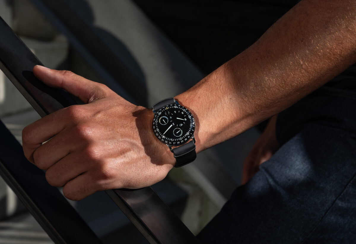
It is all in the smallest details when it comes to the evolution of Ressence watch collections and that theme continues with a fresh pair of TYPE 3 references that highlight new ways of combining black and white in ways not seen since the family first launched in 2013.
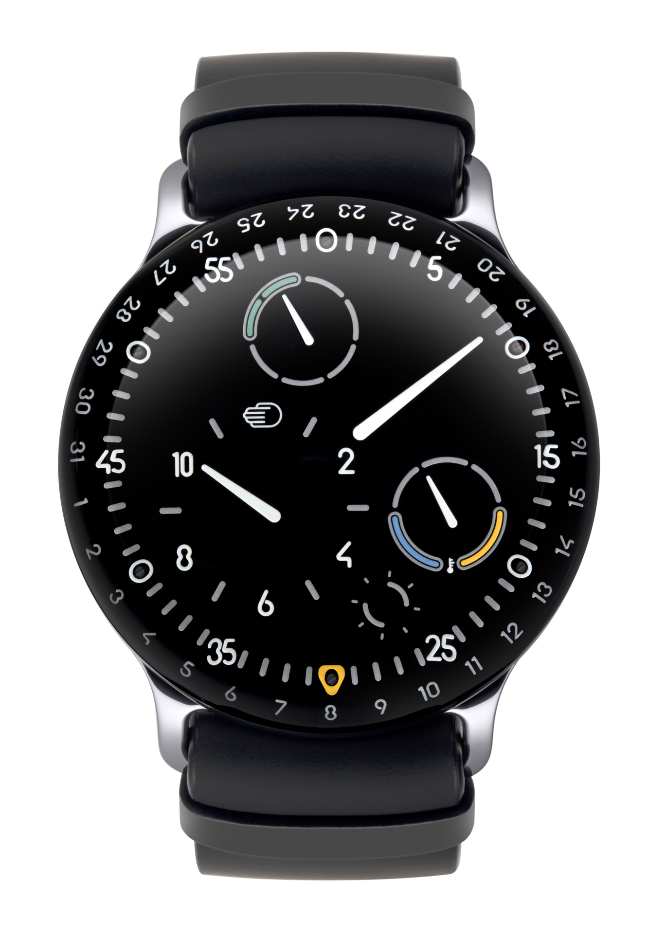
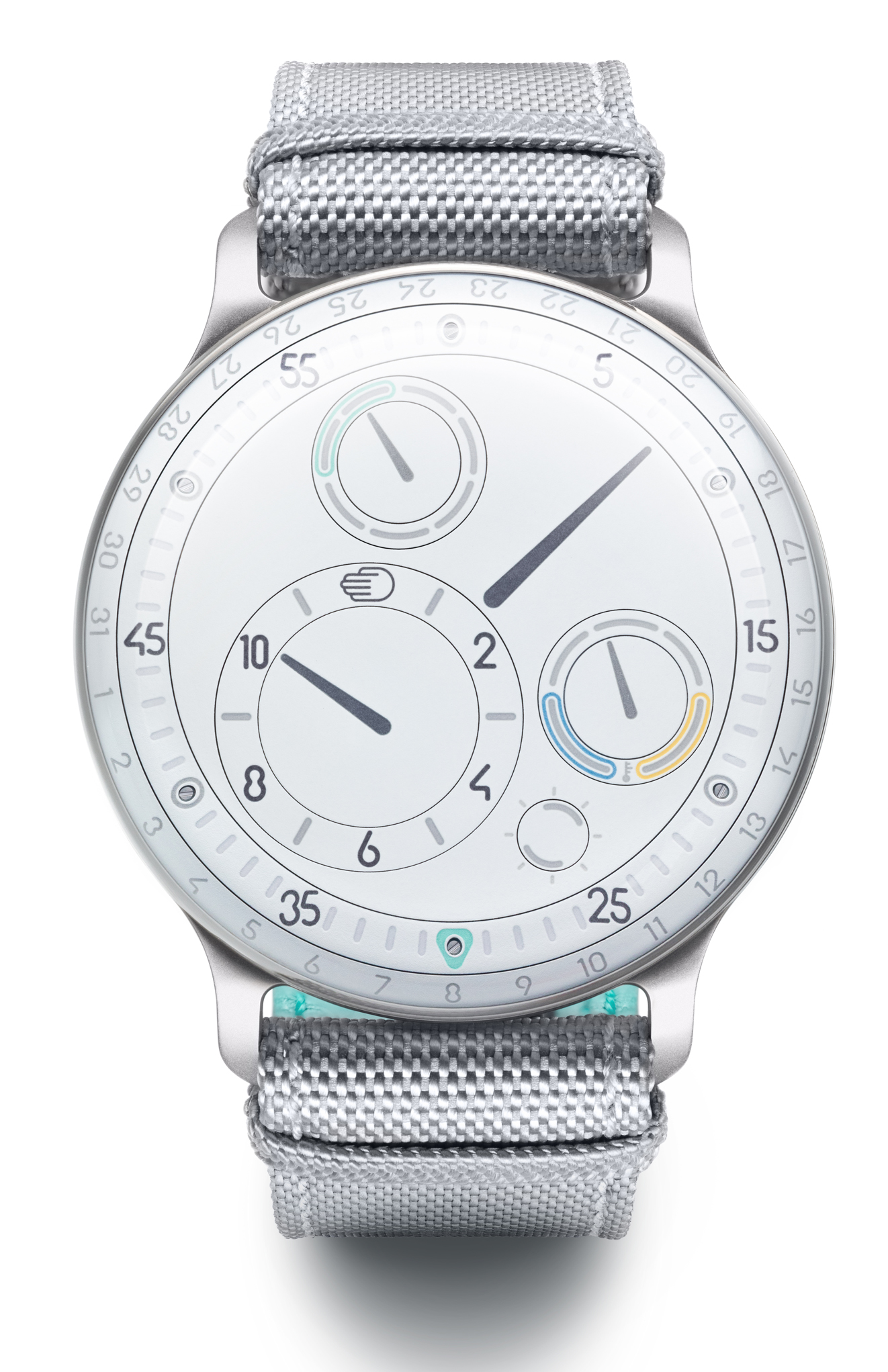
Ressence has experimented with different fonts on its dials over the past decade, but it was not until the TYPE 5 launched in 2015 that the Belgian brand established its own in-house typeface, which is being used for the two new TYPE 3 pieces.
The lines of the font are shaped by the round tool used to mill the titanium dial, which give numbers and indexes distinct rounded ends.
Another subtle change is a simplified hour disc with indexes every two hours and a redesigned shock absorber.

Small colour accents are added to the weekend days and oil temperature indicators in new pastel shades.
Ressence has also developed a more harmonious case and dial so that the slick, oil-filled face of the watch feels more in tune with the underside.
In essence, two sides of the same polished pebble.
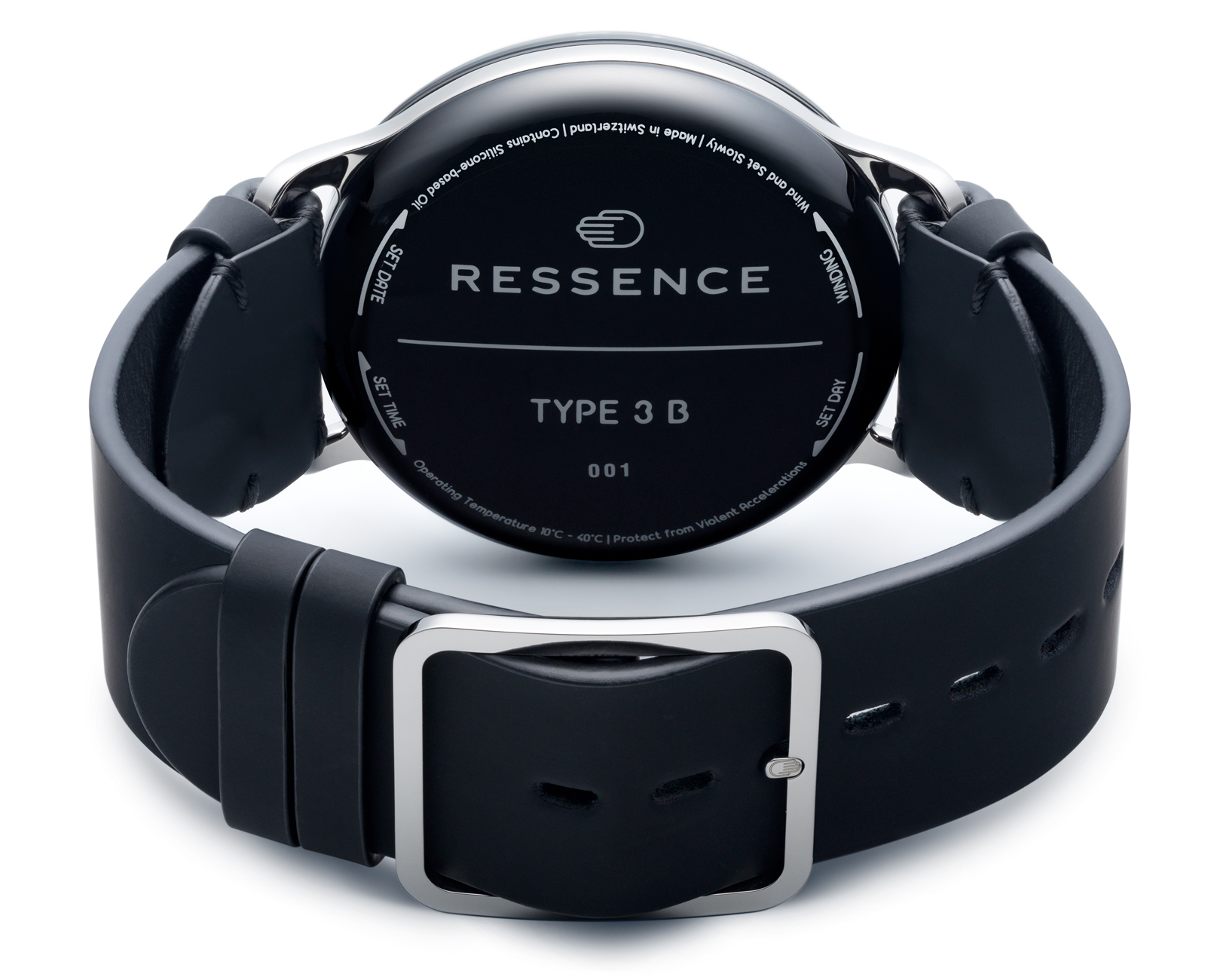
“By using oil to create a deep and contrasted projection effect on the dial, the TYPE 3 offers an experience reminiscent of a digital screen. Our new approach to the caseback not only refines the watch’s design but also pushes its dematerialization further to obtain a monolithic pebble on the wrist,” explains Benoît Mintiens, founder of Ressence.
The titanium TYPE 3 Black and TYPE 3 White, both priced at CHF 38,200, are launched alongside a TYPE 3 Eucalyptus Green and Black Black 2, which go on sale in October.